make me chic email
2019
Personal Project
SKILLS
XD
Illustrator
Branding
HTML
CSS
BRIEF
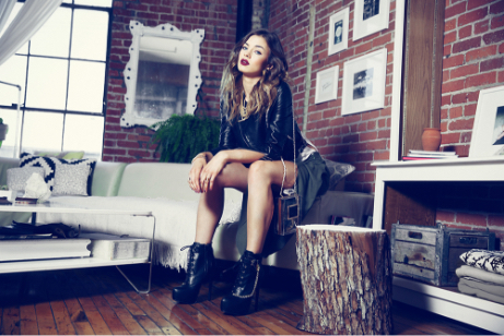
Make Me Chic is a retail store, specializing in women’s clothing. As part of a design prompt, I was given photography and copy and asked to create an email blast that was in line with the Make Me Chic brand.
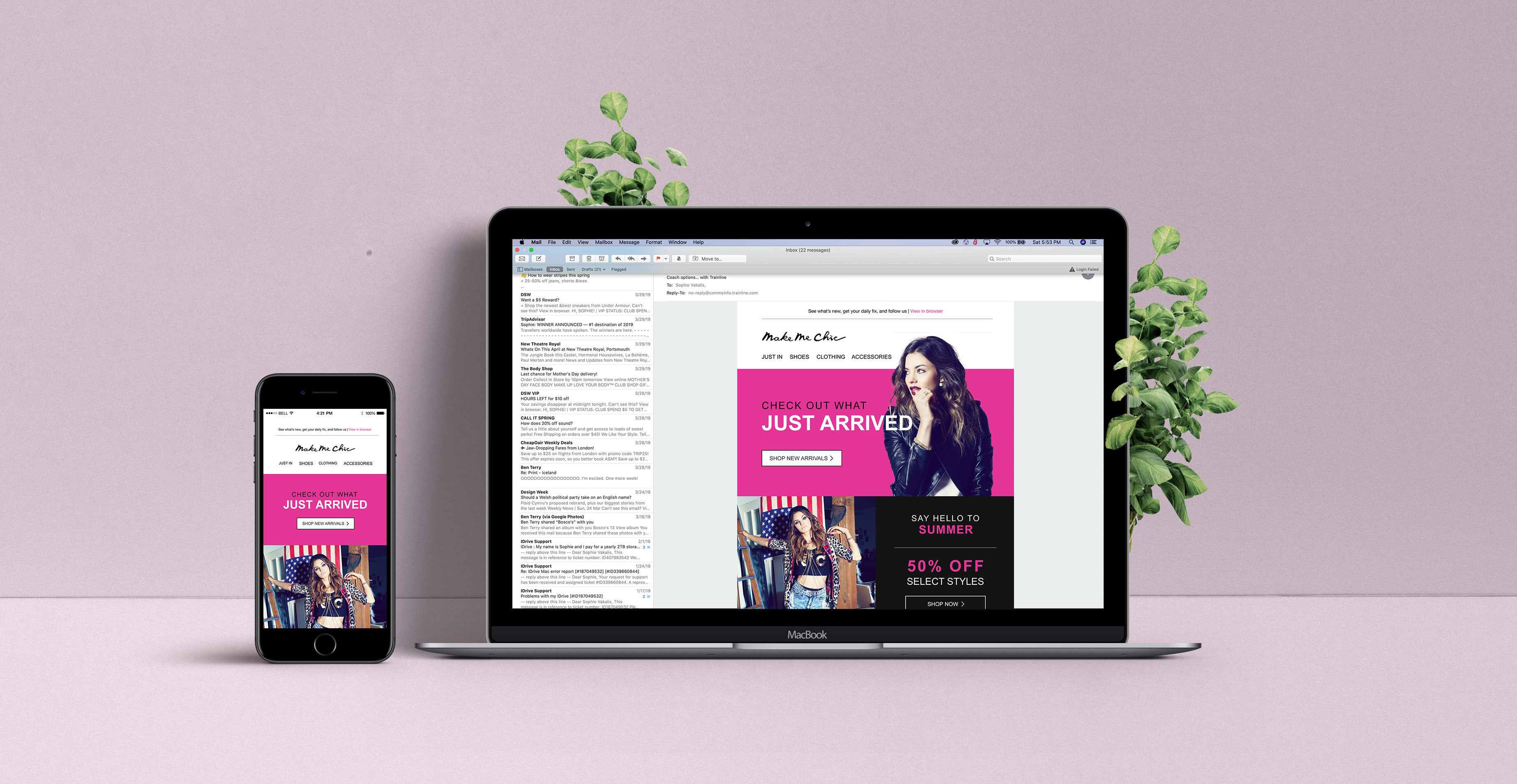
Inspiration was taken from the company website as well as outside sources to create an email that felt trendy, youthful and feminine. Effective email techniques were used in the form of a modular layout, with the most import information placed above the scrolling fold, web-friendly fonts and an appropriate image-to-text ratio.
The design was then coded using industry-standard HTML tables and inline CSS. Responsiveness was also incorporated with media queries to ensure the email displayed effectively on mobile.

CHECK OUT THE PROTOTYPE
OPTIONS
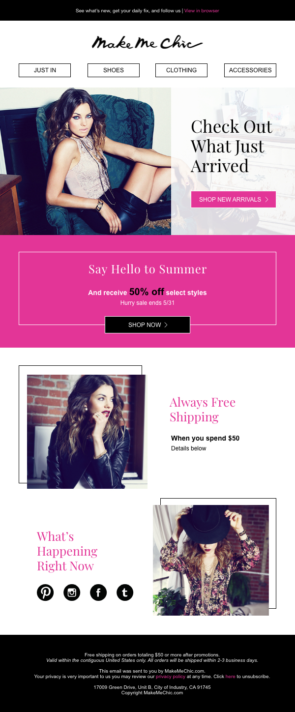
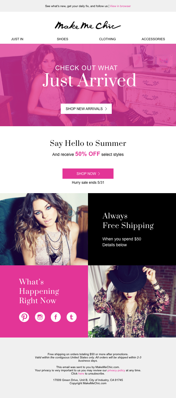
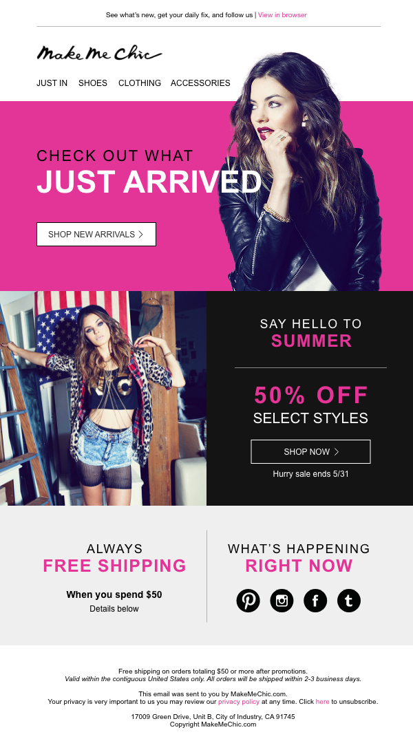
Whenever I am creating initial designs for a client, I like to present them with three different options/directions to choose from. This helps to cut down on revisions and allows for more feedback. As previously mentioned, I was only given a color palette, photography and copy to work with. Therefore, I had to infer what the tone of the email should be through context clues in the photography and on their website.
The first option is classic and refined. Serif type is used to create sophistication and delicate borders are incorporated, representing a feminine touch. The second option opposes the first, aiming for a bolder approach. Capitalized bold serifs create a fun and young tone while the use of a photo cutout on their pink background creates an impactful pop. The third option acts as a middle-ground between the first two. A color overlay is incorporated into the header along with serif text.
For more HTML/CSS designs, visit my Github
