mcv web rebrand
2019
Personal Project
SKILLS
XD
Illustrator
Branding
HTML
CSS
BRIEF
Mort Collins Ventures (MCV) is a Venture Capitalist Fund, founded and operated by Dr. Collins. His current website features general information about the fund, with emphasis on his professional investment achievements and impressive board affiliations. However, the official website lacked impact and therefore effectiveness due to it’s restricted and copy-heavy interface.
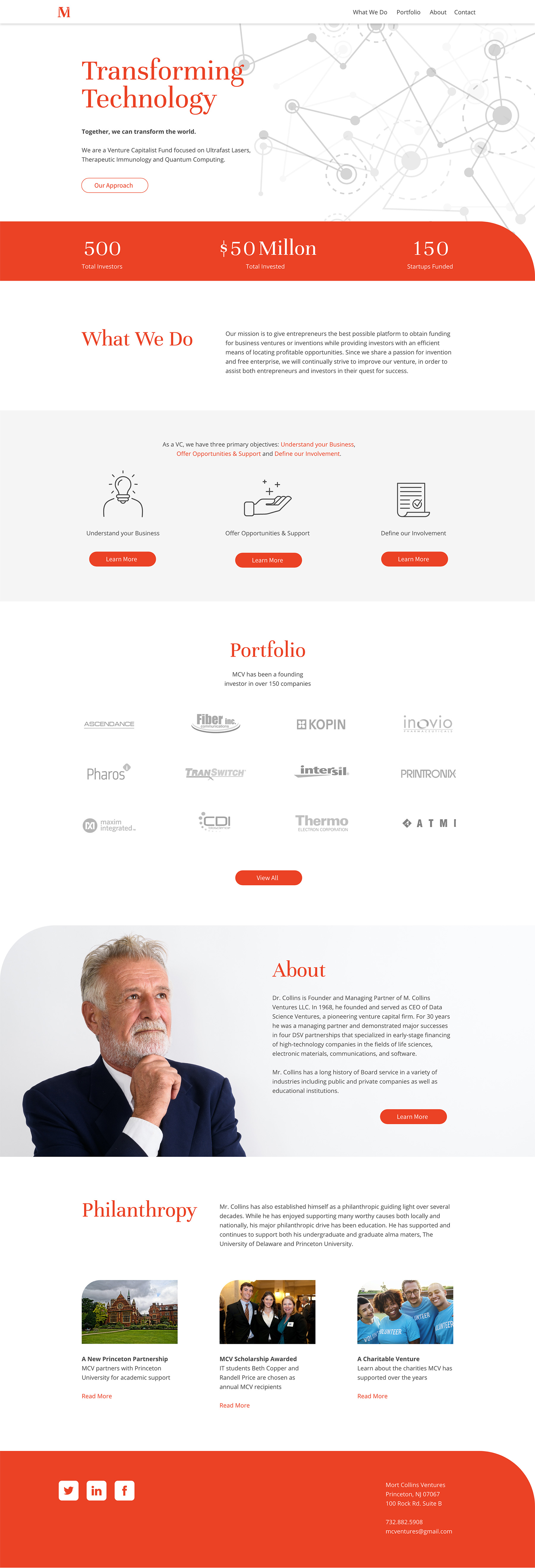
As a personal goal, I challenged myself with rebranding and redesigning the MCV home page. Therefore, this was an exercise in creating an MVP (minimum viable product) to show the possibilities of what the rebrand could look like.
Inspiration was taken from the existing brand, site, and copy to create a developed prototype. Unlike the original site, both desktop and mobile interfaces were considered and designed, creating a more modern aesthetic that would entice any entrepreneur.


CHECK OUT THE PROTOTYPE
ORIGINAL
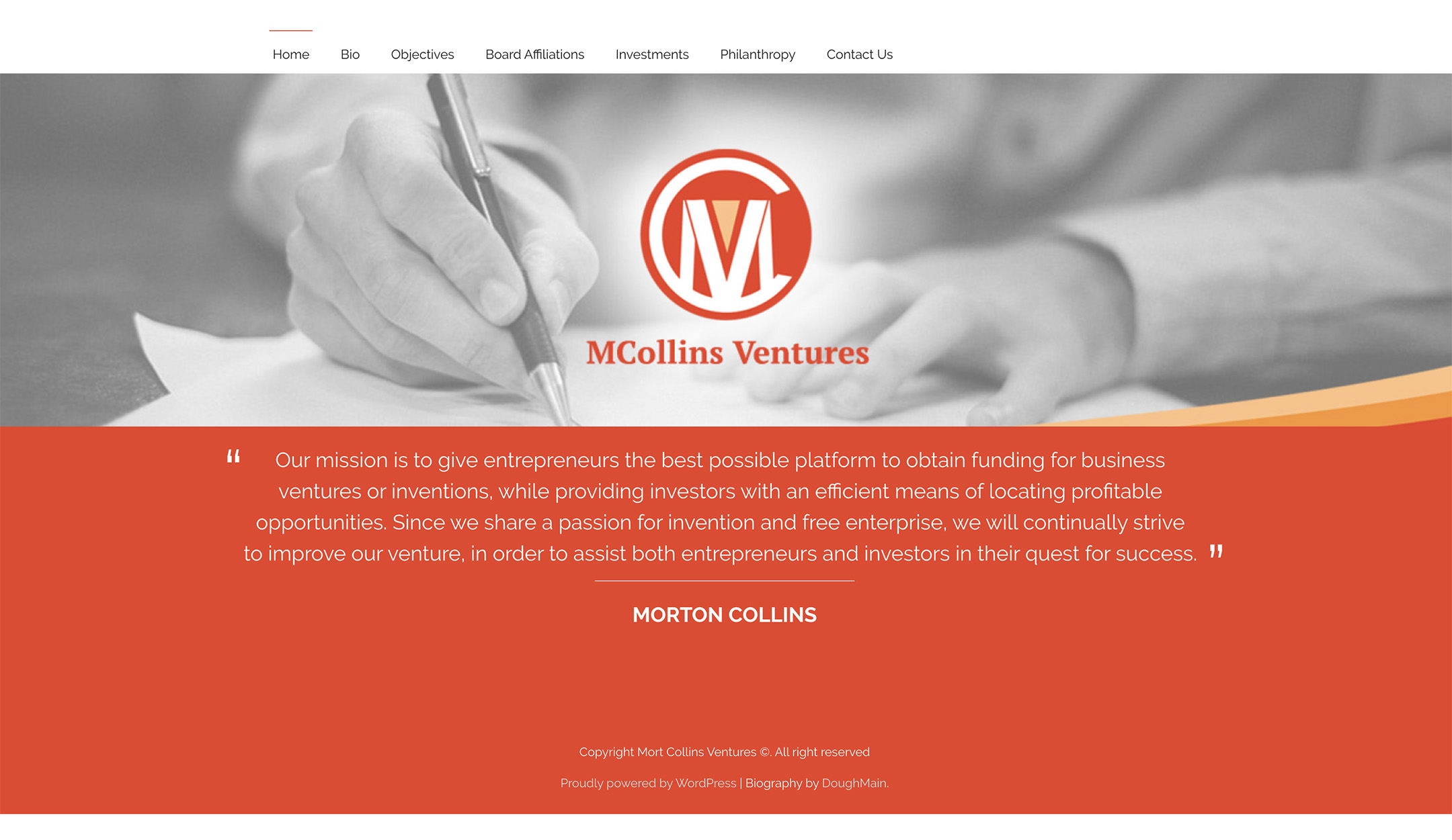
The logo incorporated the letters M, C, and V. Though interesting, the use of the sans serif logo, paired with the serif lettering underneath, felt mismatched and lacked corporate appeal. Excessive use of orange tones created a distracting look.
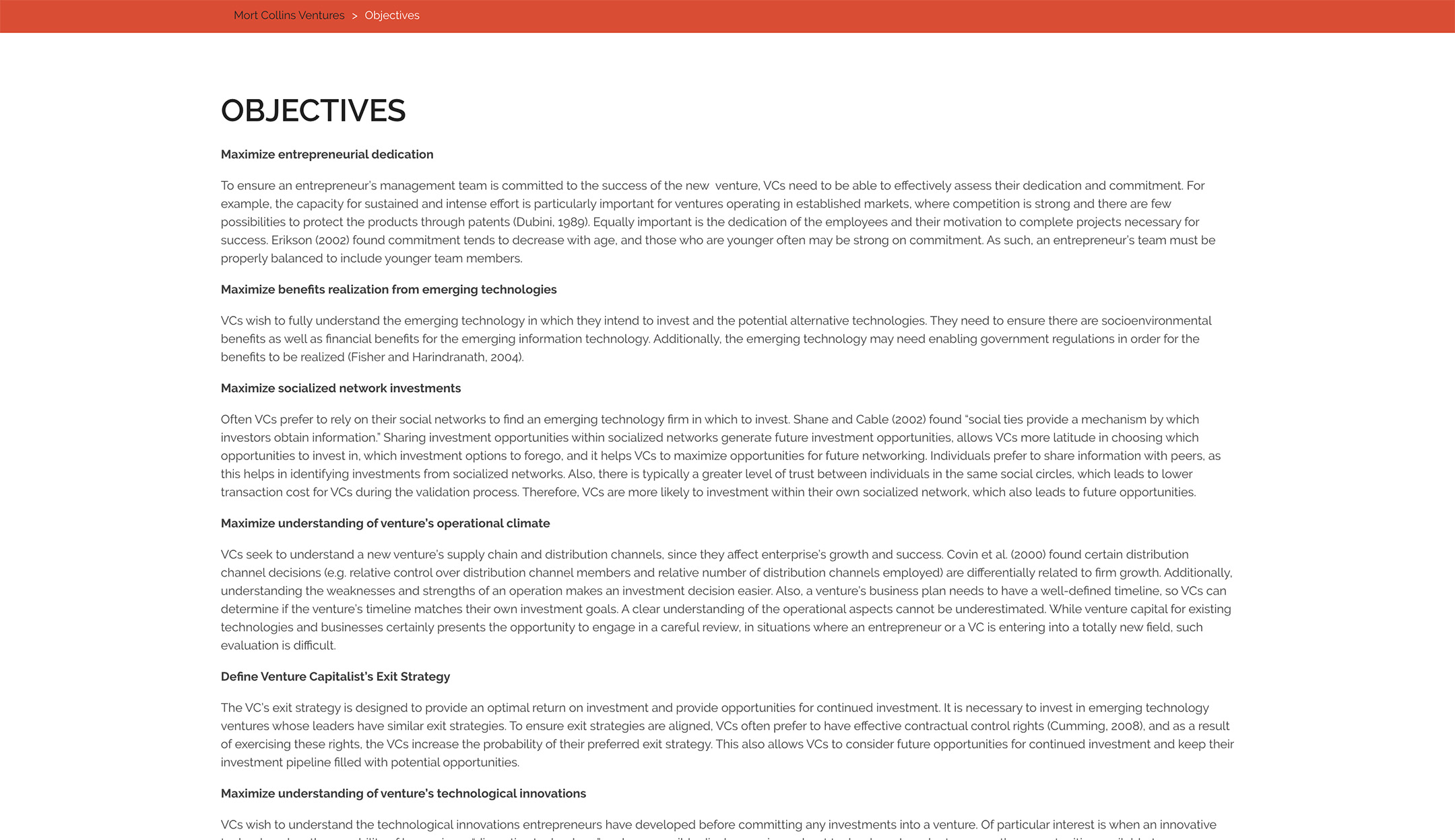
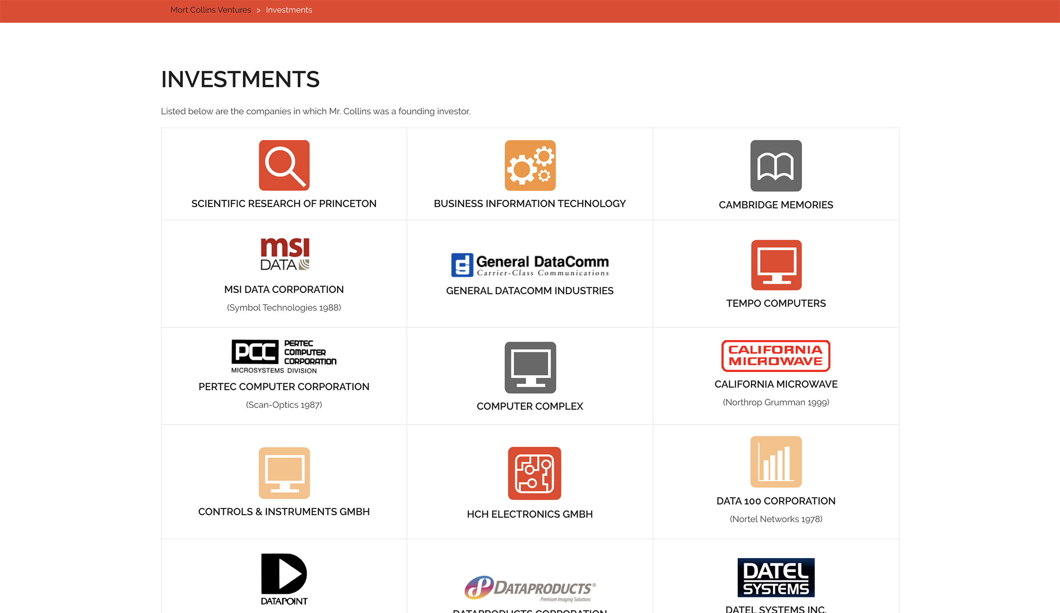
The layout of the original site was broken up into pages with just a hero image and mission statement as the home page. In addition, subtle curved edges were used within the color blocks, creating a sense of motion that was not utilized enough to be effective.
REBRAND
The new logo incorporates a serif font and was simplified into an icon that represents the brand without having to incorporate too many letters. A matching description line in the same font creates a more traditional/corporate feel. The same primary orange remains the dominate color with shades of grey to balance the brightness.
The new home page is designed in simplified sections to guide the viewer further into the website. Rounded corners were incorporated throughout the page as a nod to the original curves and as a branding identifier.
Original
Rebrand
Original
Rebrand
Original

Rebrand
Original

Rebrand
Original
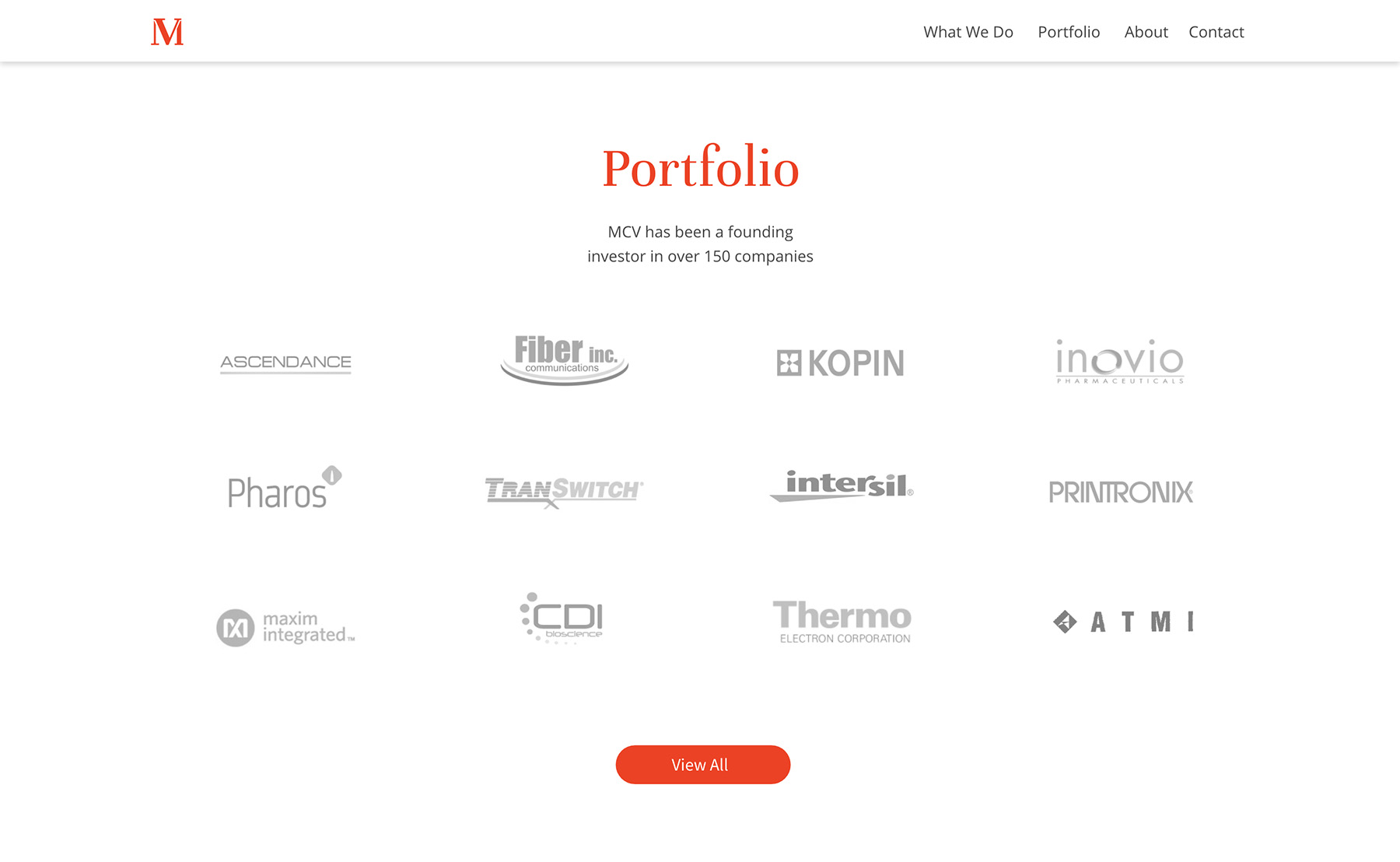
Rebrand
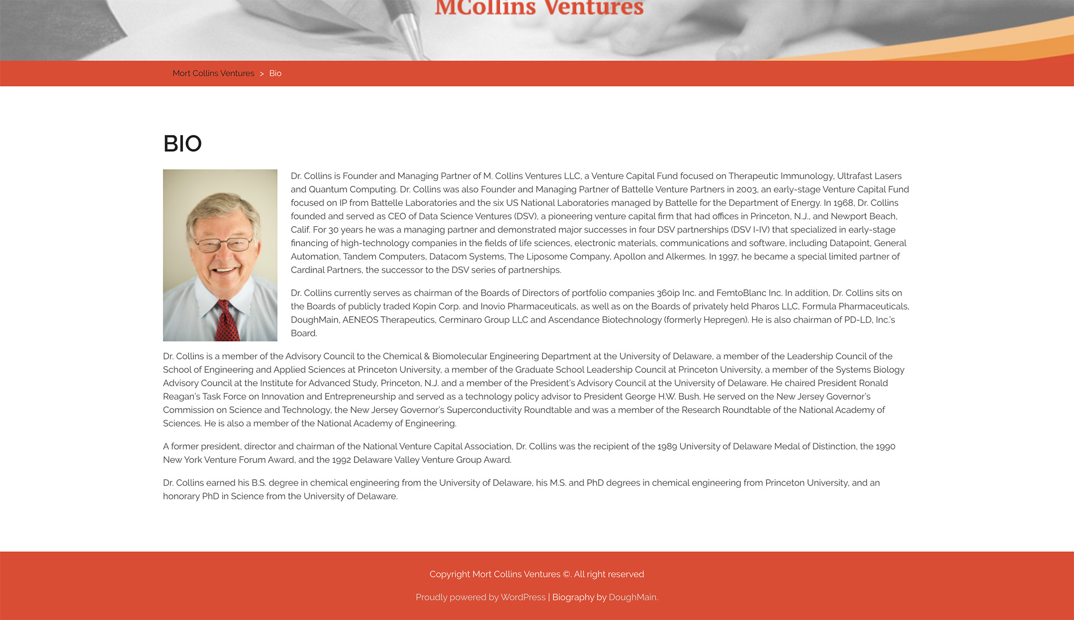
Original

Rebrand
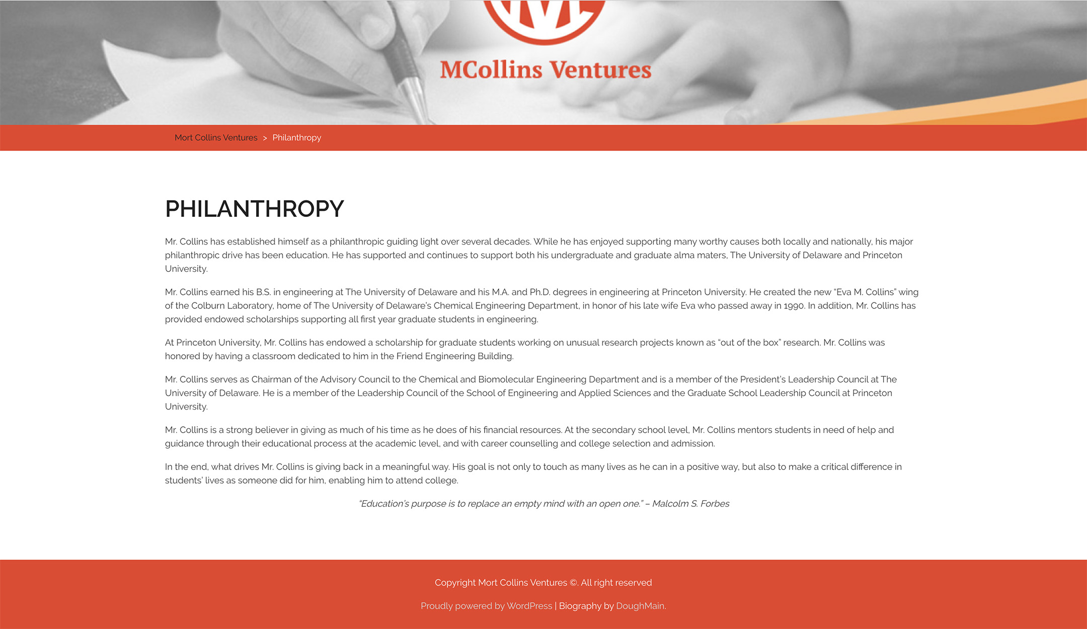
Original
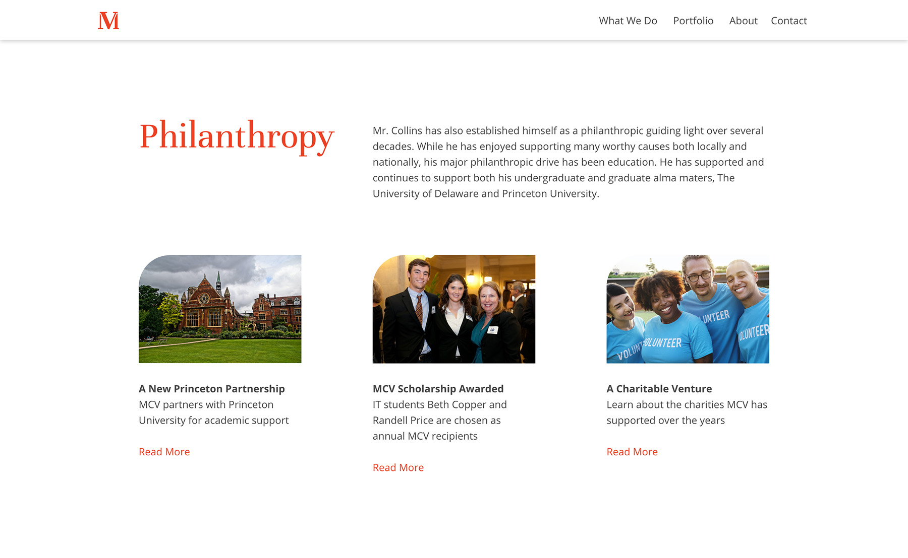
Rebrand
For more HTML/CSS designs, visit my Github